TI-BASIC:Plotn
Command Summary
Displays a statistical plot of one of six types.
Command Syntax
Plot#(type,...
The syntax varies based on the type of plot:
Plot#(Scatter, x-list, y-list, mark)
Plot#(xyLine, x-list, y-list, mark)
Plot#(Histogram, x-list, freq list)
Plot#(Boxplot, x-list, freq list)
Plot#(ModBoxplot, x-list, freq list, mark)
Plot#(NormProbPlot, data list, data axis, mark)
Menu Location
While editing a program, press:
- 2nd PLOT to access the stat plot menu.
- 1, 2, or 3 (or use arrows) to select Plot1(, Plot2(, Plot3( respectively.
(outside a program, this brings you to the plot editor screen)
TI-83/84/+/SE
1 byte
The commands Plot1(, Plot2(, and Plot3(, which are identical except for which stat plot (1, 2, or 3) they affect, define their corresponding stat plot. When the stat plot is defined, it is also turned on so no PlotsOn command is necessary.
The first argument of the commands is always the type of plot, and is one of Scatter, xyLine, Histogram, Boxplot, ModBoxplot, and NormProbPlot - these types are found in the TYPE submenu of the stat plot menu. The other arguments vary. For all but Histogram and Boxplot, there is a mark argument - this is a dot, a cross, or a box, symbols that can be found in the MARK submenu of the stat plot menu.
Scatter plot
Plot#(Scatter, x-list, y-list, mark) defines a scatter plot. The points defined by x-list and y-list are plotted using mark on the graph screen.
x-list and y-list must be the same length.
xyLine plot
Plot#(xyLine, x-list, y-list, mark) defines an xyLine plot. Similarly to a scatter plot, the points defined by x-list and y-list are plotted using mark on the graph screen, but with an xyLine plot they are also connected by a line, in the order that they occur in the lists.
x-list and y-list must be the same length.
Histogram plot
Plot#(Histogram, x-list, freq list) defines a Histogram plot. The x-axis is divided into intervals that are Xscl wide. A bar is drawn in in each interval whose height corresponds to the number of points in the interval. Points that are not between Xmin and Xmax are not tallied.
Xscl must not be too small - it can divide the screen into no more than 47 different bars.
Box plot
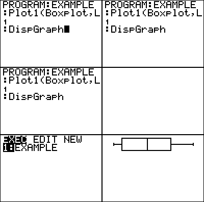
Plot#(Boxplot, x-list, freq list) defines a box plot. A rectangular box is drawn whose left edge is Q,,1,, (the first quartile) of the data, and whose right edge is Q,,3,, (the third quartile). A vertical segment is drawn within the box at the median, and 'whiskers' are drawn from the box to the minimum and maximum data points.
The box plot ignores the Ymax and Ymin dimensions of the screen, and any plots that aren't box plots or modified box plots. Each box plot takes approximately 1/3 of the screen in height, and if more than one are plotted, they will take up different areas of the screen.
Modified box plot
Plot#(ModBoxplot, x-list, freq list, mark) defines a modified box plot. This is almost entirely like the normal box plot, except that it also draws outliers. Whiskers are only drawn to the furthers point within 1.5 times the interquartile range (Q,,3,,-Q,,1,,) of the box. Beyond this point, data points are drawn individually, using mark.
The box plot ignores the Ymax and Ymin dimensions of the screen, and any plots that aren't box plots or modified box plots. Each box plot takes approximately 1/3 of the screen in height, and if more than one are plotted, they will take up different areas of the screen.
Normal probability plot
Plot#(NormProbPlot, data list, data axis, mark) defines a normal probability plot. The mean and standard deviation of the data are calculated. Then for each point, the number of standard deviations it is from the mean is calculated, and the point is plotted against this number using mark. data axis can be either X or Y: it determines whether the value of a point determines it's x-coordinate or y-coordinate.
The point behind this rather convoluted process is to test the extent to which the data is normally distributed. If it follows the normal distribution closely, then the result will be close to a straight line - otherwise it will be curved.
Advanced Uses
After doing a regression, a scatter plot of ∟RESID against the x-list is a useful measure of the effectiveness of the regression. If the plot appears random, this is a good sign; if there is a pattern to the plot, this means it's likely that a better regression model exists.
Optimization
The ∟ symbol at the beginning of list names can be omitted everywhere in this command.
In addition, every element except the plot type and the data list or data lists are optional, and take on the following default values:
- freq list is 1 by default, meaning that all frequencies are 1.
- mark is the box by default.
- data axis is X by default.
Error Conditions
- ERR:DIM MISMATCH is thrown if the x and y lists, or the data and frequency lists, have different dimensions.
- ERR:STAT is thrown if Xscl is too small in the case of a Histogram.
All errors are thrown when plotting the stat plot, as opposed to when the command is executed, and do not provide a 2:Goto option.
